
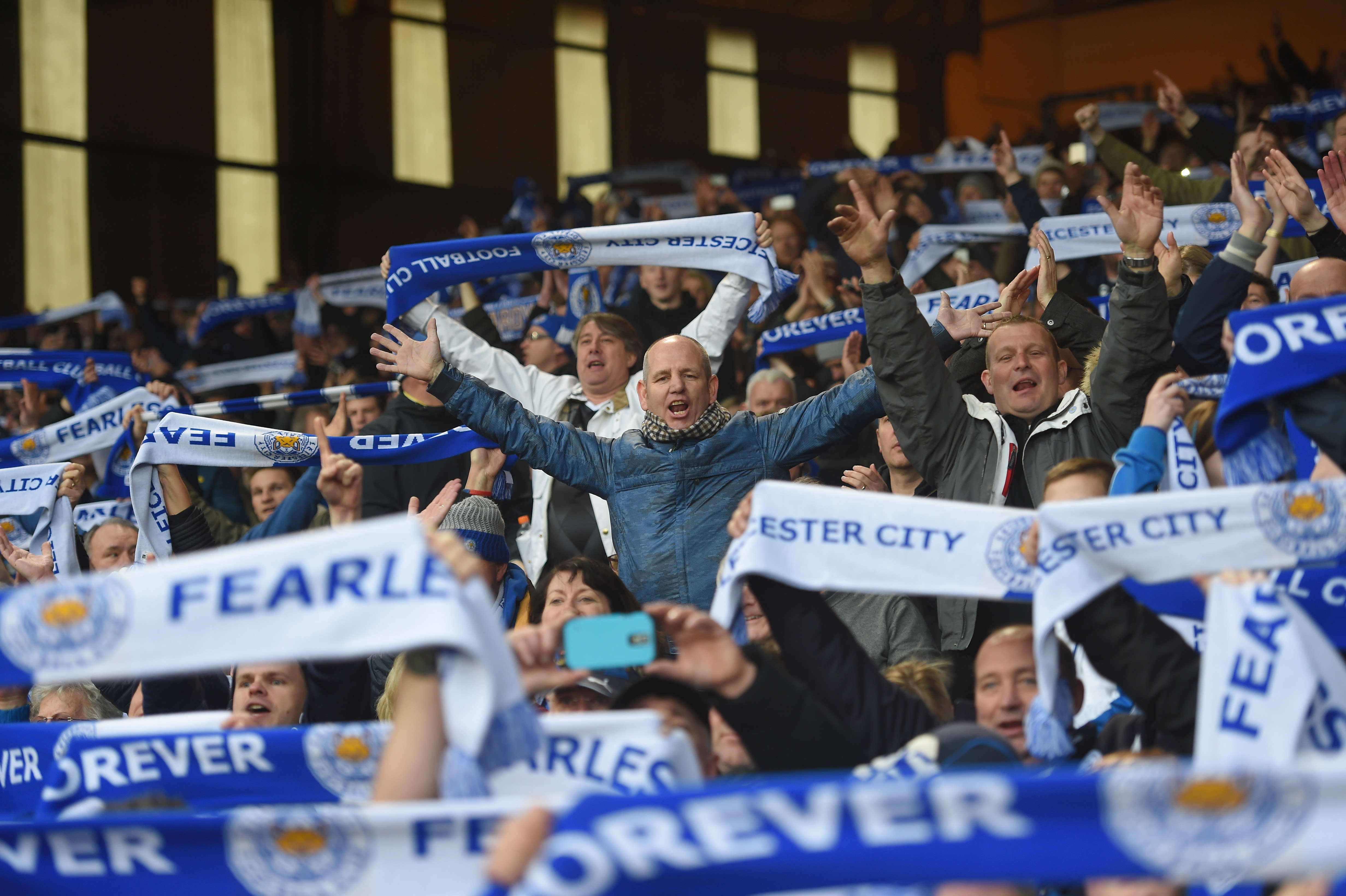


The English Premier League season starts on August 8 and we at 32 Flags cannot wait for the start of the EPL and the rest of the European league season. One of the great things about the new season is the new kit designs from all the teams. Some kits are works of art while some aren’t so much. We’ll cover the worst kits a little bit later in the week. For now, we’re here to talk the best kits of the season.
I wanted to make sure I had one kit from every team so while there were teams who could have had multiple kits qualify, only one for each team was chosen. Also, as I was going through the best and worst kits I noticed how important it is to be able to incorporate the kit sponsor into the design. Except for Tottenham, all the kit sponsors on here are incorporated into the kit. The kit sponsor is one with the kit and that goes a long way. Sometimes that makes the difference between being on this list and on the worst kit list.
Another thing that you will notice, many of these kits are on the “basic” side. Meaning that these kits weren’t some wild and crazy design and and primarily a single color with a couple other colors to round out the kit. While some teams like to go out there with their designs, as these ten kits show, sometimes “less is more” and a conservative look can be a better look.
Anyway, let’s get to the list.
10) Tottenham Hotspur – Home
Tottenham brings out this retro looking home kit.

I like this because while it isn’t really a retro kit, the slashes and the “AIA” logo make it seem as if this could have been worn in the late 70’s. Under Armour is trying to break into the soccer world and they’re trying it with their most high profile client.
9) West Bromwich Albion – Away
West Brom kept it classy with a fancy monogrammed kit that Hugh Hefner would be proud to wear.
The lettering is a very extreme throwback as West Brom used to first carry this lettering in the early days of the team in the late 1800’s. With the pinstripes down the front, it’s a very traditional kit but it’s classy nonetheless.
8) Newcastle United – Home
When you are a team with a legendary and traditional kit design, it’s tough to recreate different designs when the kits have to have black and white vertical stripes. Newcastle added a little bit of blue and it made all the difference.
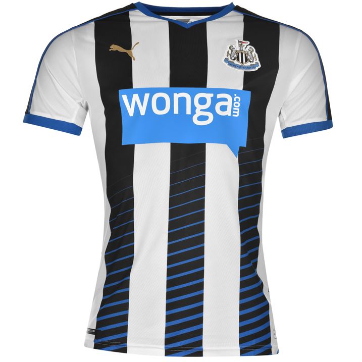
Puma added just the slightest bit of detail by adding blue on the black lines of the kit and have it lighter and lighter as the blue diagonal lines went up the kit. That along with incorporating the blue “wonga.com” logo, makes this an attractive looking kit.
7) Swansea City – Home
Swansea went gold and white with their home design this year.
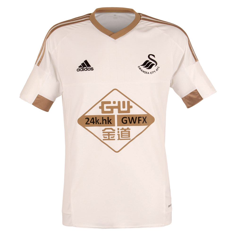
To celebrate their 100th year as a team, Swansea City put out this royal looking kit and it looks terrific and truly a special kit. The “GWFX” sponsorship logo rounds out the design. The kit definitely flows together really well.
6) Arsenal – Away
Continuing on the gold trend, Arsenal goes all gold for their away kits.
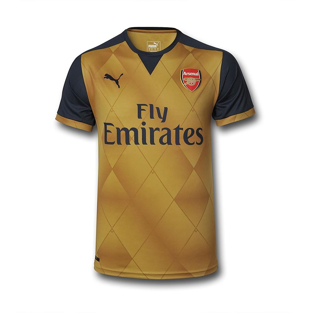
Just like with Swansea, Arsenal went gold for their away kit. It should be pointed out that Puma designed all their teams away kits in a very similar way. While the colors are different, all away kits will have a diamond pattern on the kit. Obviously with two in the top 10, I am a big fan of this design. For Arsenal’s, they went gold with dark blue sleeves.
CONTINUE TO SEE THE TOP 5