
It’s the offseason, which means we can have a little fun around here. This is one of the deadest periods in the National Football League calendar with the games completed and the NFL Scouting Combine not yet upon us. So how to fill the silence?
Here’s a ranking of all 32 current NFL uniforms, from worst to first:
32. Tampa Bay Buccaneers
The alarm clock font and oversized logo on the helmet are both brutal. Bring back Bucco Bruce baby.
31. Jacksonville Jaguars
The two-tone helmet has actually grown on me, but the uniform is too busy. Simplicity is usually better, as proven here.
30. Cincinnati Bengals
The Bengals have good colors but went overboard on the orange. Scale back those orange tops and the ranking will rise.
29. Atlanta Falcons
Atlanta has one of the more boring uniforms in the league. The red tops are nice, everything else is blah.
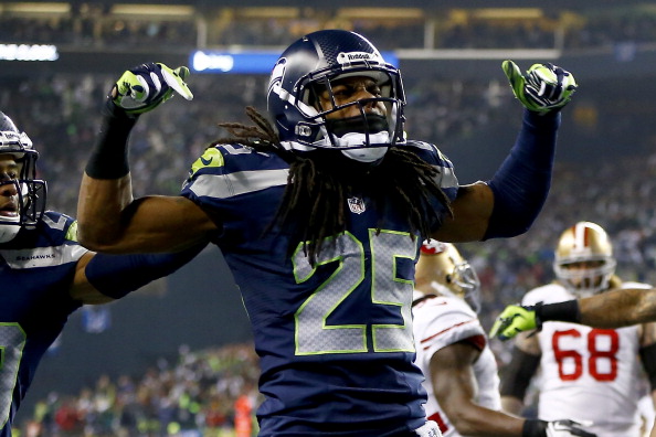
28. Seattle Seahawks
The Seahawks have a cool logo but the uniform is just saturated in blue. Give me a little break with some white.
27. Tennessee Titans
Tennessee has a lot of jersey combos and I’m not in love with any of them. The helmet is also mediocre.
26. Baltimore Ravens
I love the purple, but any team with pants that don’t include a stripe is getting docked. Fix your pants!
25. Carolina Panthers
The electric blue needs to go and the helmet is mundane. Not a terrible set, but just nothing that pops.
24. Houston Texans
Houston has nice colors but the helmet holds it back. Nothing horribly wrong, but a boring set in many ways.
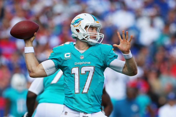
23. Miami Dolphins
The Dolphins had great uniforms in the Dan Marino days, but the recent updates are too futuristic. I hate the new helmet stripe.
22. Arizona Cardinals
Arizona has a classic helmet but the pants are odd. Why not have a stripe all the way down the pants? C’mon fellas.
21. New Orleans Saints
The Saints have an iconic logo. However, we go back to the pants. Why can’t there be a stripe?
20. Philadelphia Eagles
Bring back the Kelly Green. Look at how the unis popped when Randall Cunningham played. The tops are too damn dark.
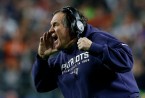
19. New England Patriots
This is a solid uniform, although the piping is nonsense. Also, we need the hilarious Pat Patriot back in our lives.
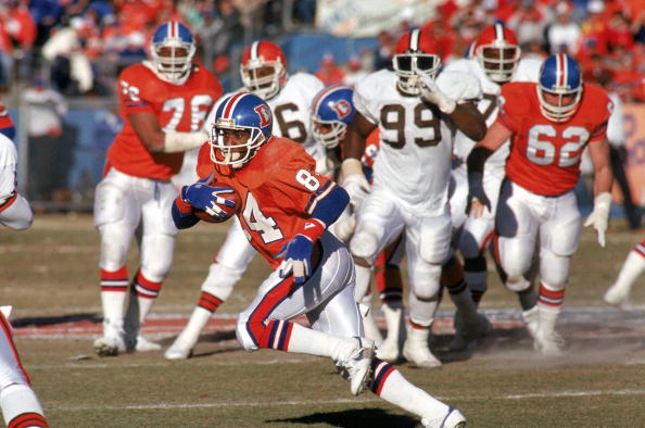
18. Denver Broncos
The Broncos have great colors, although the number font is clunky and the pants need a better stripe. Also, they left behind one of the best helmet logos ever.
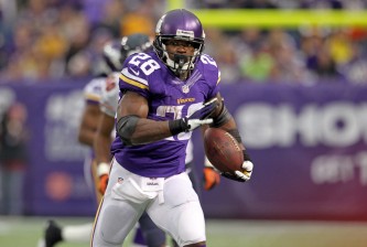
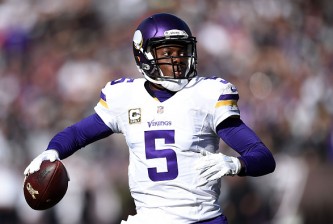
17. Minnesota Vikings
The purple/yellow combo is very nice, and the helmet is a oldie but goodie. Not spectacular, but solid.
16. St. Louis Rams
I love the helmet (the Rams were the first team with a helmet logo). However, ditch the gold and bring back the yellow.
15. Buffalo Bills
Buffalo gave its uniform an awesome makeover with white helmets and lighter blue tops, ditching the Drew Bledsoe era. Only quibble? Lose the logo over the last name.
14. New York Giants
I’m a fan of the “GIANTS” helmets, but this current uniform is a beauty. That said, trash those red uniforms.
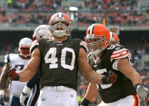
13. Cleveland Browns
Cleveland’s uniform is basic and plain, but so vintage. Don’t ever, ever, put a logo on that helmet.
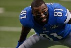
12. Detroit Lions
The Lions have great colors with the silver and blue. Detroit has a great, distinctive look.
11. San Francisco 49ers
The 49ers thankfully went back to their Joe Montana-era unis after those brutal Tim Rattay’s. The helmet is iconic.
10. San Diego Chargers
There is not a prettier uniform in sports than when San Diego wears the powder blues. The helmet is mediocre, but the rest is perfect.
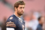
9. Chicago Bears
Chicago has never really changed and for good reason. The Bears stayed simple and it was a top-notch choice.
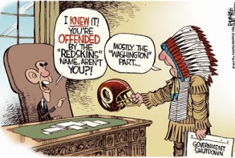
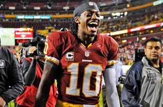
8. Washington Redskins (excluding controversy)
Washington enjoys great helmets and the burgundy is fantastic. The uniform pops and is easily recognizable.
7. New York Jets
The Jets have a classic, simple design. The green and white compliment each other perfectly along with the beautiful helmet design.
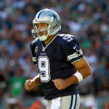
6. Dallas Cowboys
Many people are not pleased with this, certainly. Dallas has epic uniforms, but why not wear more than just white tops?
5. Indianapolis Colts
The blue and white combo is perfect, and the horseshoe is appropriately vintage. From Andrew Luck to Johnny Unitas, great stuff.
4. Pittsburgh Steelers
Few uniforms match a city better than the black and gold of the Steelers. Pittsburgh is a tough town, and the colors represent that.
3. Kansas City Chiefs
The helmet is simple yet powerful with the “KC” interlocking inside the arrowhead. The jersey itself is clean and crisp, popping off the screen.
2. Oakland Raiders
If you walk up to any sports fan and mention the “Silver and Black,” they know who you are talking about. Enough said.
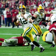
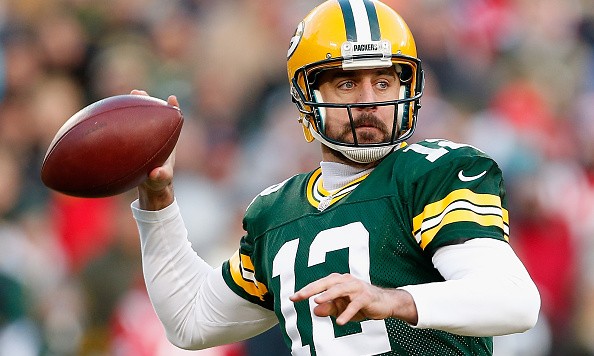
1. Green Bay Packers
The best color combo in sports, topped off with a simple helmet fixed on a perfect shade of yellow. The Packers got it right in every way.